


***My series on Color Mixing Parts 1-9 has been so successful that I decided to simply combine all of the lessons into one lesson for my readers convenience. You will find the following information very useful in your everyday life.
If you would enjoy having this tool at your fingertips please feel free to download a copy of my eBook - "The Color Wheel Made Easy" found in the Amazon Kindle bookstore at this link:
http://www.amazon.com/COLOR-WHEEL-MADE-EASY-ebook/dp/B00BMB8QPW .
My eBook can be downloaded onto any electronic device for quick and easy viewing through the Amazon Kindle Bookstore.
LESSONS IN COLOR MIXING
Part 1-9
For many years I had wanted to learn the art of oil painting on canvas. However, it just seemed to somewhat intimidate me Why? Because I felt it was important to learn the art of mixing color in order to feel comfortable painting. I took a few private lessons from a fantastic artist, but the colors just weren't quite correct in the painting that I first did.
Of course, I also chose a harder than life subject to paint which didn't help (lol). I was a bit discouraged so didn't pick up a brush for awhile. I didn't have my own oil paint and supplies at the time, so decided to wait until I could invest in those before attempting another painting.
I had been mentally absorbing Mr. Bob Ross' technique for years through viewing his programs on public TV and was anxious to see what I could do with it. Since learning to oil paint had been a lifetime goal, I decided to take the plunge and order the supplies needed to get started.
Through Dick Blick mail order art supplies I ordered everything I needed to get started including the Bob Ross master paint set. I was very excited to get started and actually completed my first masterpiece in about 4 hours! Then a few days later painted another and and then several more.
My family and friends were so impressed they began to commission paintings from me.
One thing is missing here though. Bob Ross doesn't teach the art of mixing oil color in the master paint set. So now, I still didn't know how to mix various colors of paint. Several other TV series that I viewed featured oil color artists who kept mentioning that they only use 3-5 colors of oil paint, then mix any color under the rainbow with those colors. However, they never did teach how to accomplish such a feat.
Finally, I got an email one day from an artist in Australia who was giving a live video showing over the internet about mixing oil color. I had my own color mixing chart, but really needed a bit more mentoring to figure it out so I watched the video. It was absolutely enlightening.
I'm going to share with you some of what I learned about mixing oil color and how you can too can easily learn to mix oil color for painting and how you can use the art of color mixing to enhance your everyday life through creating color pleasing crafts, fashions, home decorating, etc.
PRIMARY COLORS
Below is a chart showing the three primary colors: Red, Yellow, Blue. In Oil paint that would represent, Cadmium Red, Cadmium Yellow and French Ultramarine Blue. These three colors are from which ALL others are made.

SECONDARY COLORS
Now if you mix these primary colors together in various combinations they will make up SECONDARY colors: orange, green, and violet.

Then, by mixing various combinations of these secondary colors, you will create INTERMEDIATE colors and so on.
INTERMEDIATE COLORS
Now, I will share with you an easy way to mix INTERMEDIATE COLORS.
INTERMEDIATE colors are reached by mixing one primary color +(plus) one secondary color as shown in the diagram below.

TINTS, TONES, SHADES
TINTS are achieved by adding WHITE to a color.
TONES are achieved by adding GRAY to a color.
SHADES are achieved by adding BLACK to a color.
The amount of WHITE, GRAY or BLACK that is added to a color will determine the intensity of the TINT, TONE, or SHADE.
WARM AND COOLS COLORS
Now that we have reviewed PRIMARY, SECONDARY & INTERMEDIATE colors, TINTS, TONES & SHADES, we will now learn which of these colors are WARM or COOL colors.
WARM and COOL colors are colors that reflect emotional values. They add warmth or coolness to a painting, hand knitted or crocheted item or to any number of other artistic pieces.
The WARM colors are: Yellow to Red-Violet on the Color Wheel.
The COOL colors are: Yellow-Green to Violet on the Color Wheel.

COLOR HARMONIES
Now we will focus on Color Harmonies, colors that go together. These color harmonies include, Complementary, Triadic Harmony, and Split Complementary.
Learning COLOR HARMONIES helps us develop harmonies in color and color patterns that are useful when developing designs for hand knit or crochet projects, painting, and in many other artistic pursuits.
The first of the color harmonies, Complementary Colors are colors that are opposite each other on the color wheel as shown below. The chart below the color wheel shows how the colors complement each other.

Learning how colors can complement one another is so important in every day life and will help us in designing handmade crafts, fine arts, decorating, in our wardrobe, etc.
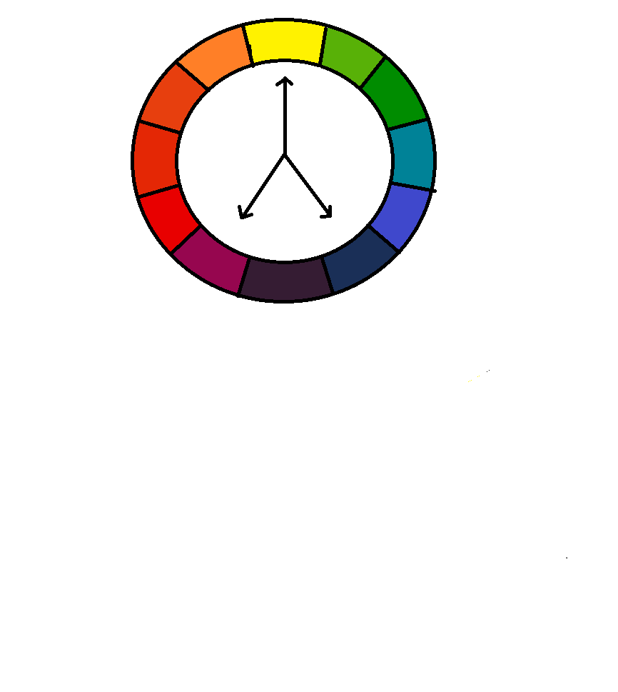
TRIADIC COLOR HARMONY
To find a Triadic Color Harmony on the color wheel, select a color, then choose two additional colors that are equally spaced apart. This concept is shown in the color wheel diagram below.

The color chart that is located below the color wheel above shows how triadic colors compliment each other.
Using the concepts of selecting color harmonies is helpful in everyday living as we choose pleasing colors to design knitting, crochet & sewing projects, designing home decor, entertaining, cooking, creating artwork and in almost every aspect of life.
SPLIT COMPLEMENTARY COLORS
Split Complementary Colors are a color and the two colors next to it's complement on the color wheel.
This is shown in the color wheel shown below:

Using Split Complementary Colors to design fashions,
knitting, crocheting, art work, in decorating,etc. makes them more
interesting and pleasing to the eye.
TRIAD & TETRAD
COMPLEMENTARY COLORS
Learning how to use the color wheel in every day applications can be both challenging and rewarding.
The final two color harmonies that we will be discussing are Triad and Tetrad complementary colors.
Triad colors are three colors that are equally spaced on the color wheel as shown in the diagram below:

Tetrad colors are four colors that are equally spaced on the color wheel as shown in the diagram below:

COLOR DEFINITIONS
QUICK REFERENCENow that we have reviewed the main components of Color, it is important to have a quick reference guide to Color and it's definitions. The chart below gives Color definitions for your convenience.

COLOR: Described by the three dimensions of intensity, hue, and value.
Intensity: Also known as Saturation or Chroma. Means the relative degree of brightness or dullness of a color.
Hue: A specific color family with it's relative degree of warmness or coolness.
Value: The relative degree of lightness or darkness of a color.
Primary Color: Yellow, Red and Blue. These colors cannot be mixed from any other colors.
Secondary Color: Two primary colors mixed together resulting in Green, Orange and Violet.
Intermediate Color: Also known as Tertiary Colors. Achieved when one primary and one secondary color are mixed together.
Warm or Advancing Colors: Yellow, Red and Orange colors.
Cool or Receding Colors: Green, Blue, and Violet colors.
Tint: White plus Color.
Tone: Gray plus Color or it's compliment.
Shade: Black plus Color.
Key Color: A Dominant Color in a color scheme or mixture.
Neutral Gray: A Combination of White and Black.
Chromatic: A Color with hue, including Red, Green and Violet, etc.
Achromatic: A Color without hue, including White, Black and Gray.
Achromatic Color Scheme: A Color scheme using only White, Black and Gray.
Monochromatic Color Scheme: a Color Scheme using one color in different values.
Analogous Color Scheme: A Color Scheme using colors that lie next to one another on the color wheel.
Complementary Color Scheme: A Color Scheme using colors directly opposite on the the color wheel.
Split-Complementary Color Scheme: A Color Scheme using one color plus the two colors next to it's complement on the color wheel.
Triad: Three Colors equally spaced on the color wheel.
Tetrad: Four Colors equally spaced on the color wheel.
Now you can use this quick reference guide along with Lessons in Color Mixing when designing your craft items, crochet and knit pieces, your art work, fashions and in decorating!
Great info! I haven't touched my oil paints in far too long, and you've inspired me to pick up a brush again.
ReplyDeleteWOW! I'm not a painter at all, but I do mix clay colors. This might come in handy. I'm bookmarking it for reference.
ReplyDeletewhat a great reference tool - Thanks!
ReplyDeleteWonderful info! Marking this.
ReplyDeleteThank you for the great tutorial. Although, you had me at the thought of "happy little clouds." :)
ReplyDeleteyou definatley made me think here, will save this as I know I will need it again.
ReplyDeleteI really loved reading your blog. It was very well authored and easy to undertand. Unlike additional blogs I have read which are really not tht good. I also found your posts very interesting. In fact after reading, I had to go show it to my friend and he ejoyed it as well!
ReplyDeleteOmega 3 Essential fatty acids
I find learning about color theory very useful.
ReplyDelete